On-demand fuel delivery · Iraq
Banzeeni
Two live apps in Iraq, rebuilt around one rule: one decision per screen.
- Role
- Senior Product Designer
- Timeline
- Feb – Oct 2023
- Platform
- iOS, Android & Web

Where it started
When I joined in February 2023, Banzeeni already had two live apps and a website: a customer app for ordering fuel and car services, and a driver app for the people delivering them.
Interviews and store reviews said the same thing — the flows were hard to follow. The drivers struggled most: often older, under time pressure, and not comfortable with apps.
I was brought in to redesign both apps and the website from the ground up. That redesign took six months. I stayed two years, through build, handoff, and the work that followed.
The customer app when I joined
A map with two products floating on it, three steps stacked in one sheet, and English options inside an Arabic form.
What people told us
- It takes too long to refuel during working hours.
- I wish I didn't have to visit a fuel station myself.
- I hate switching between ride apps and fuel loyalty apps.
- I want fuel delivery after midnight, but most companies are closed.
Three of the four are about time and place. The fourth is about too many apps. That became the brief: one app, any hour, no station.
Who I designed for
Three kinds of customers, and the person on the other end of every order.
Refuelling eats my morning, and ride prices jump when I need one.
Omar, 34 · Office worker
I won't go to a station alone at night.
Salma, 28 · Freelancer
I can't leave the route to fill up between runs.
Youssef, 40 · Courier
The other user
I've got gloves on and a customer waiting.
Karwan, 45 · Pilot, fuel delivery
He works outdoors, under time pressure, often with gloves on. He's the reason the driver side shows one job, one status, one button at a time.
What I benchmarked
I benchmarked Cafu for fuel delivery, and Careem and Grab for ride-hailing. Careem is the one people in Erbil already use, so its ordering → dispatch → tracking → rating loop set the shape customers would expect.
What none of them had was a driver side built for people handling fuel in the field. That became the harder half of the work.
What I was solving for
- Make ordering fuel as easy as ordering a taxi, for people who had never done it in an app.
- Seven services in one app without it becoming seven apps.
- A driver side that works in the field: gloves, sun, time pressure, low comfort with apps.
- Three languages, two directions, two modes — without designing everything three times.
The rule
One decision per screen. Every service is a step flow.
The old app asked for everything at once.
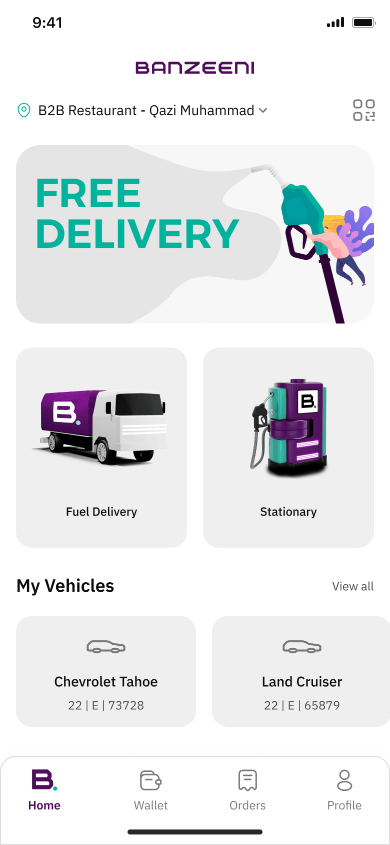
The redesign asks one question, confirms it, and moves on. Customers always know where they are; pilots always know what to do now. Every one of the seven services uses the same skeleton, so learning one means knowing them all.
The home screen, before and after
Same job. A starting point instead of a map.
The map moved out of the way. Services are the first thing you see, the order starts with one tap, and your vehicles are already there. Nothing asks for input until you've chosen what you want.
Before
After
Fuel delivery, one decision at a time
- 01
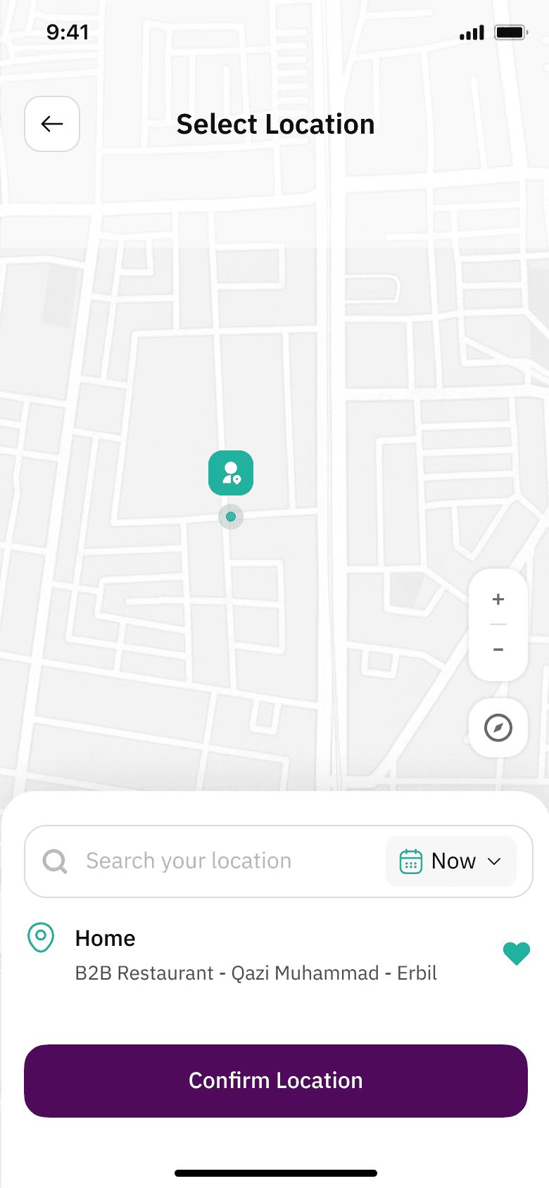
Where
Drop the pin or pick a saved place. No street address needed.
- 02
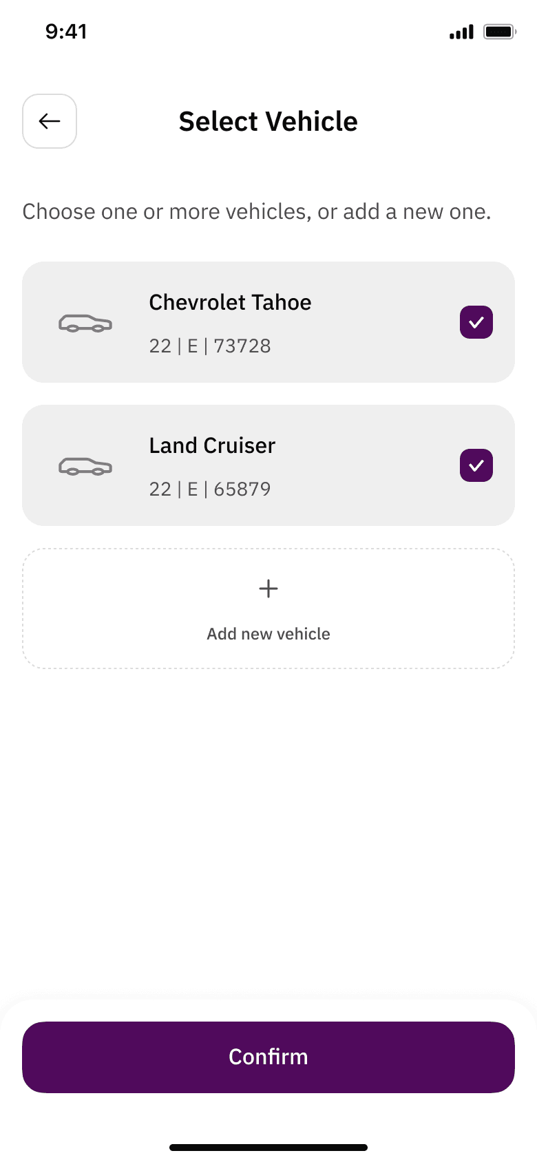
Which vehicle
Saved vehicles first; add a new one in one form.
- 03
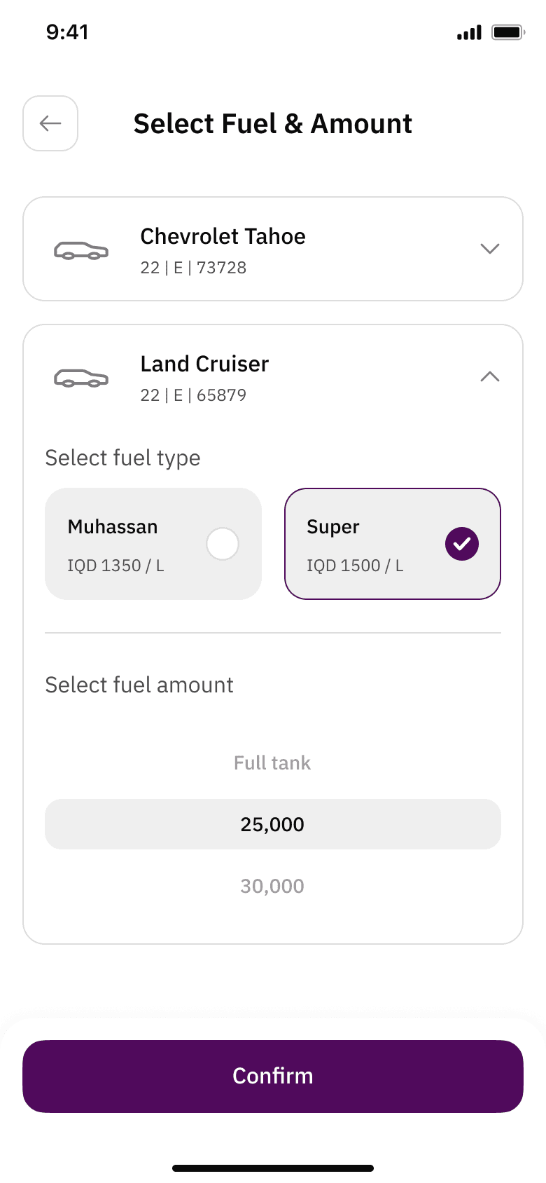
Fuel type and amount
Type, then litres or full tank. Prices shown before choosing.
- 04
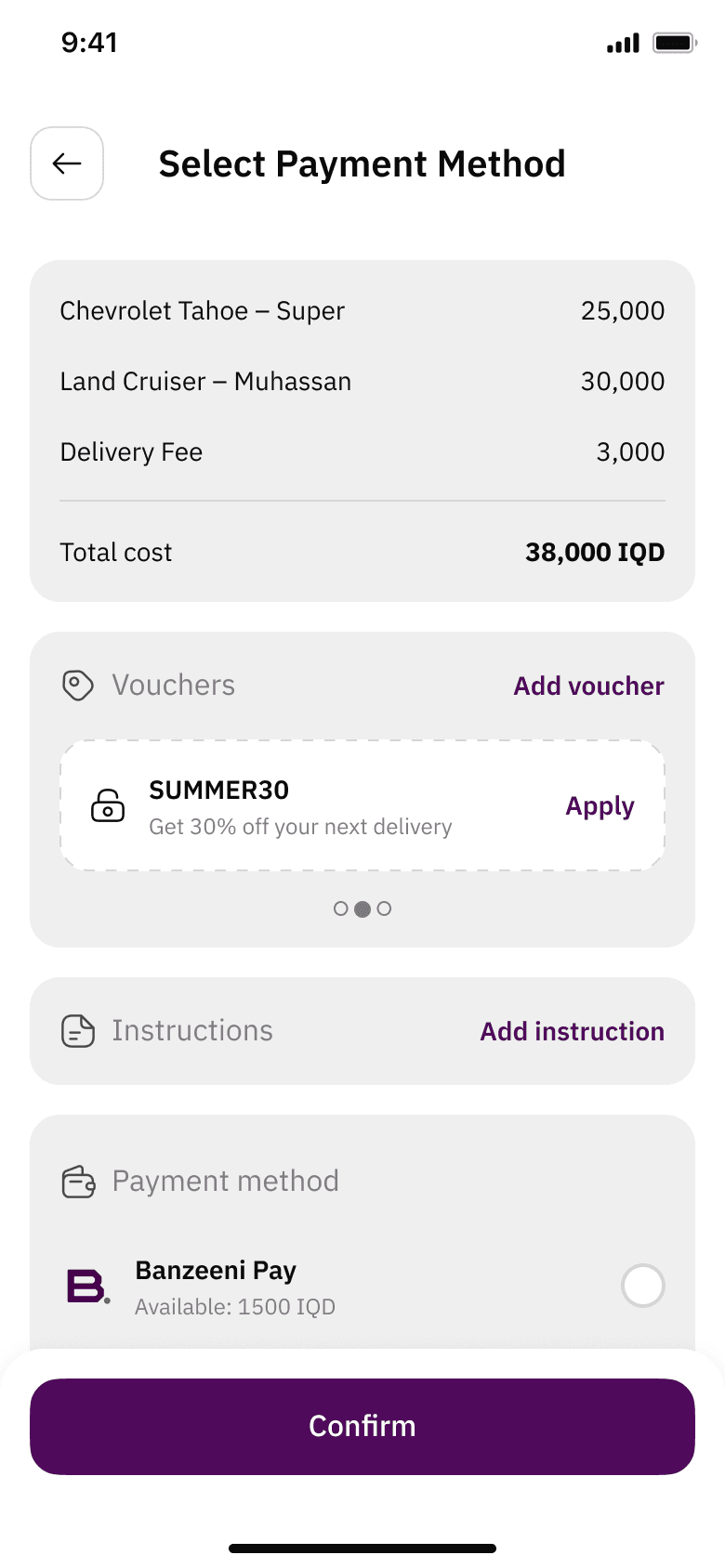
Payment
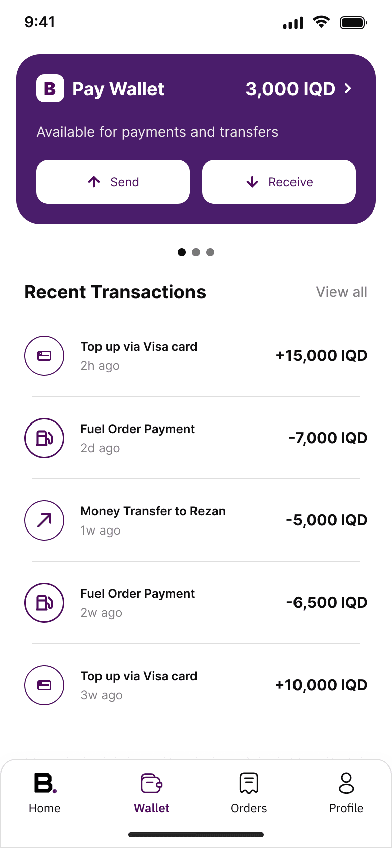
Wallet, cash, or card. Loyalty points apply here.
- 05
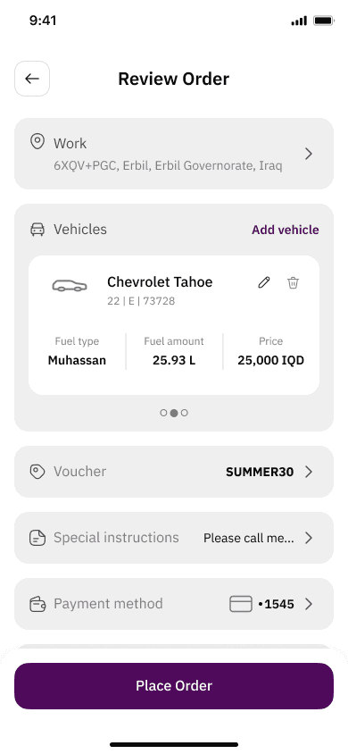
Review
Fuel price and delivery fee on separate lines, then the total.
- 06
Track
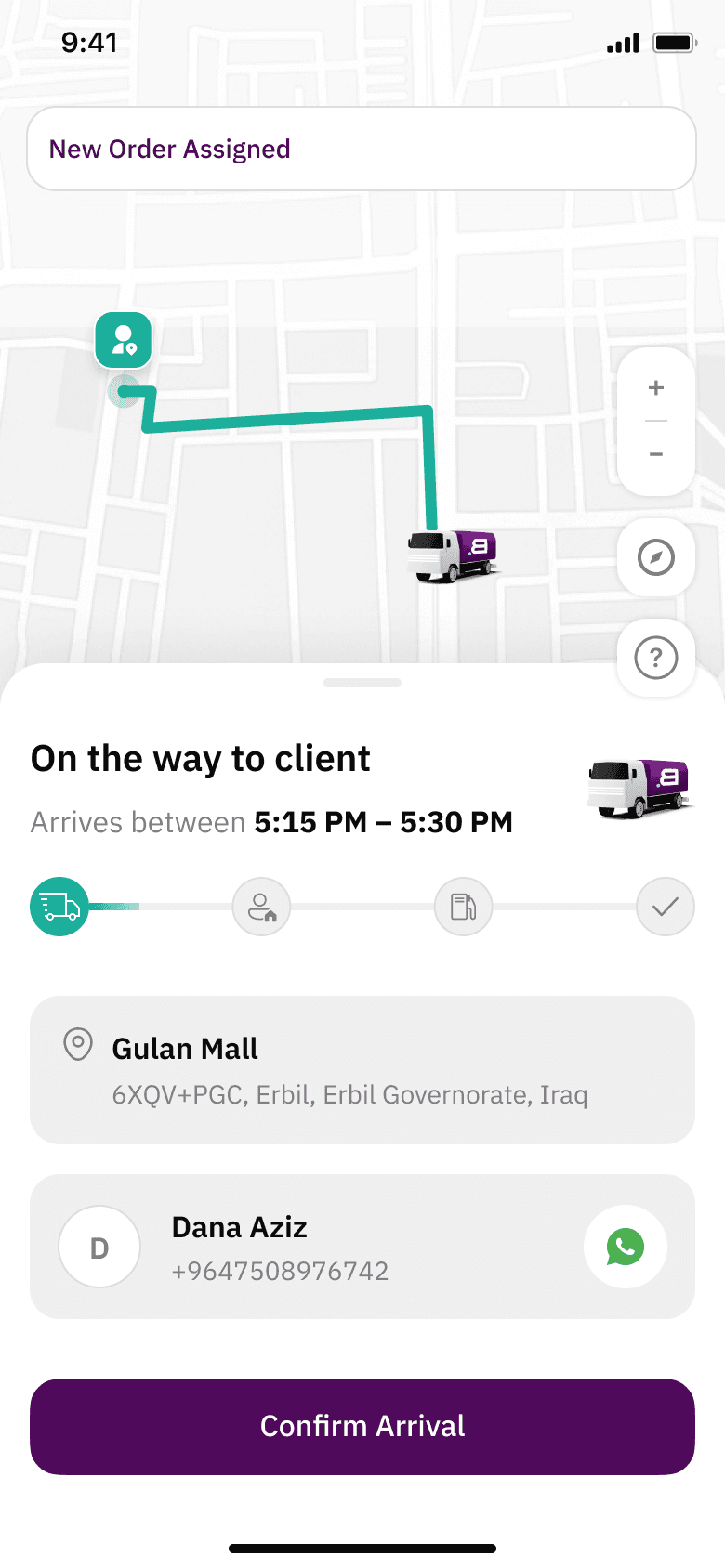
Live pilot location, ETA, and a call button. Nothing else.
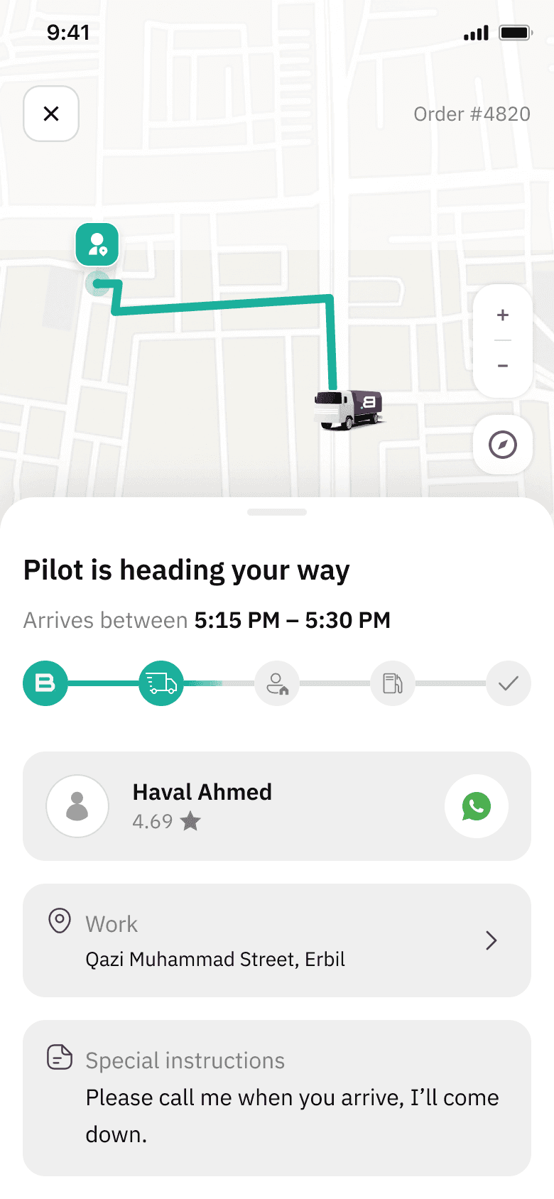
Same skeleton, seven services
Once the fuel flow worked, every other service was the same pattern with different questions in the middle.
The one step that changes
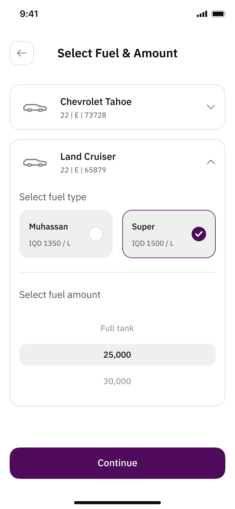
Fuel delivery
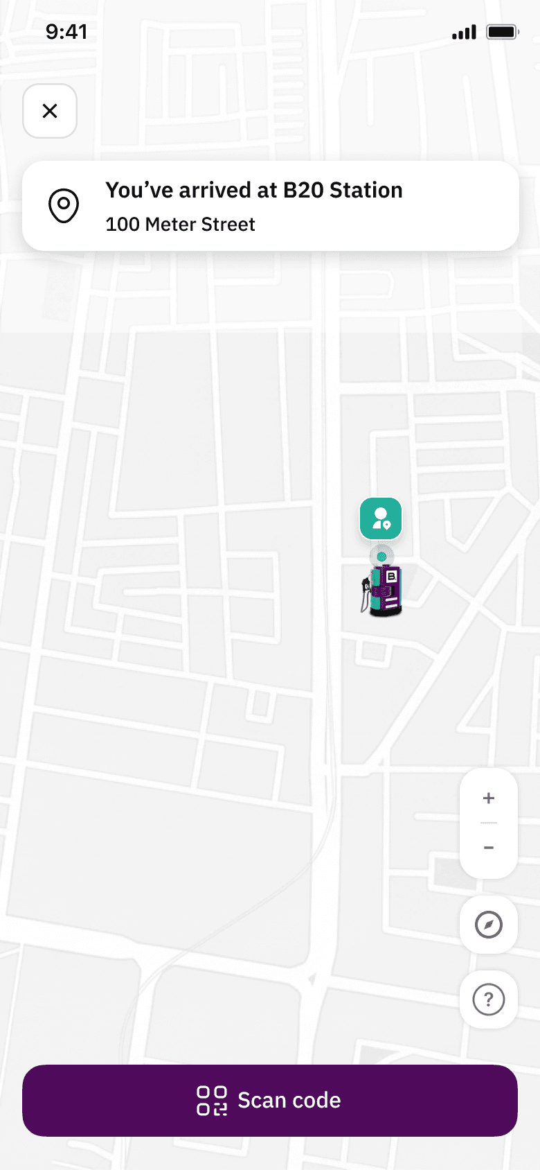
Stationary
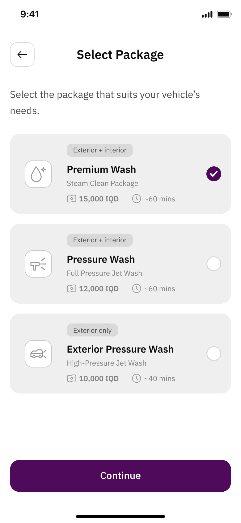
Car wash
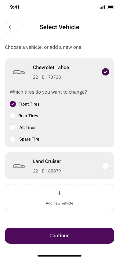
Tire change
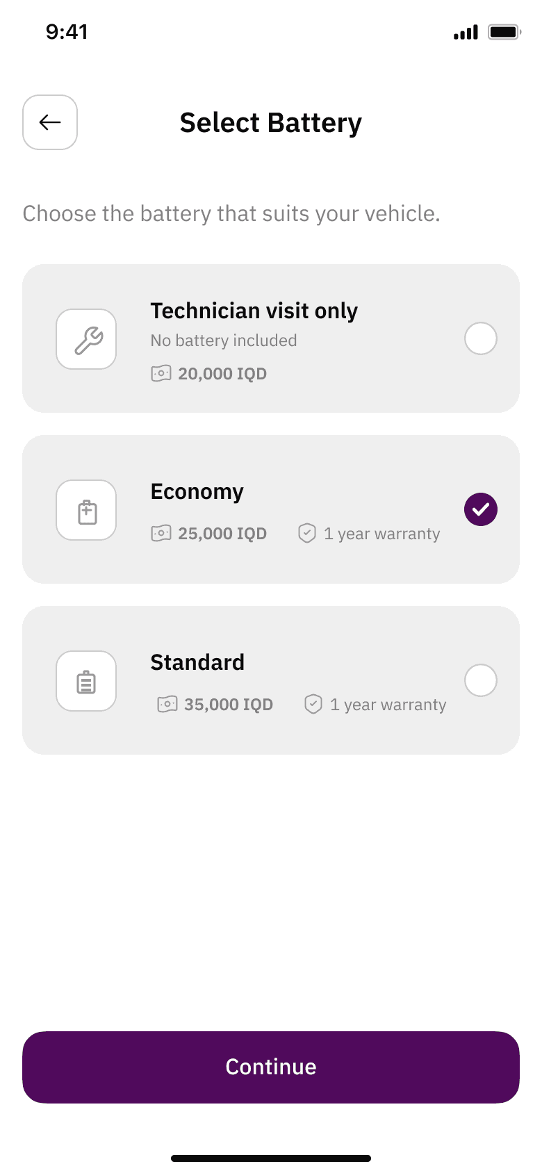
Battery change
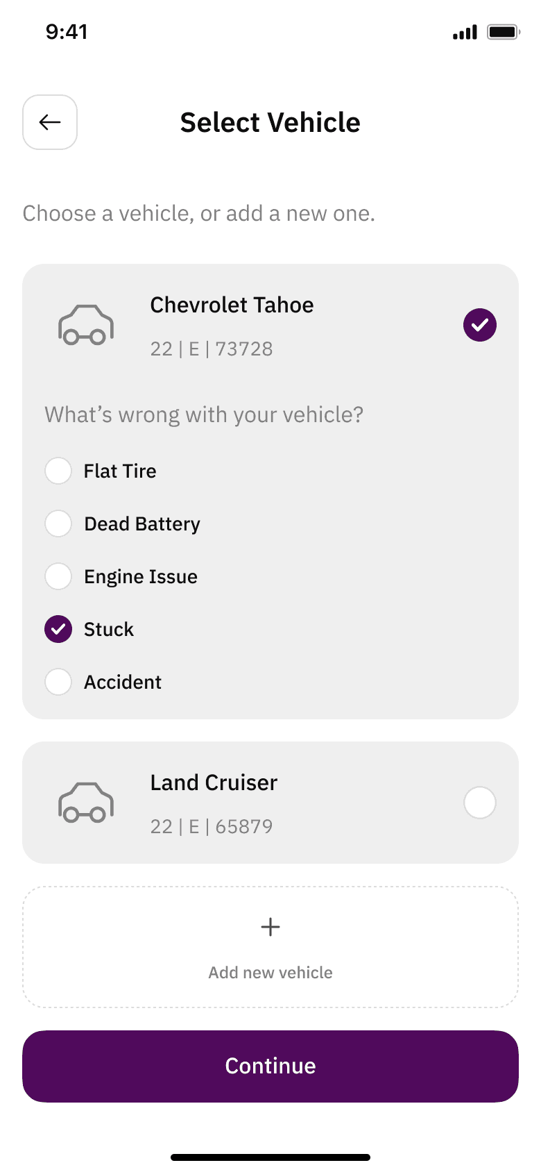
Crane
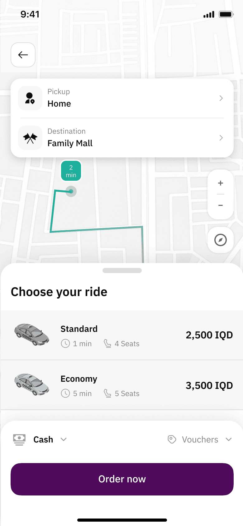
Transport
The other side of the order
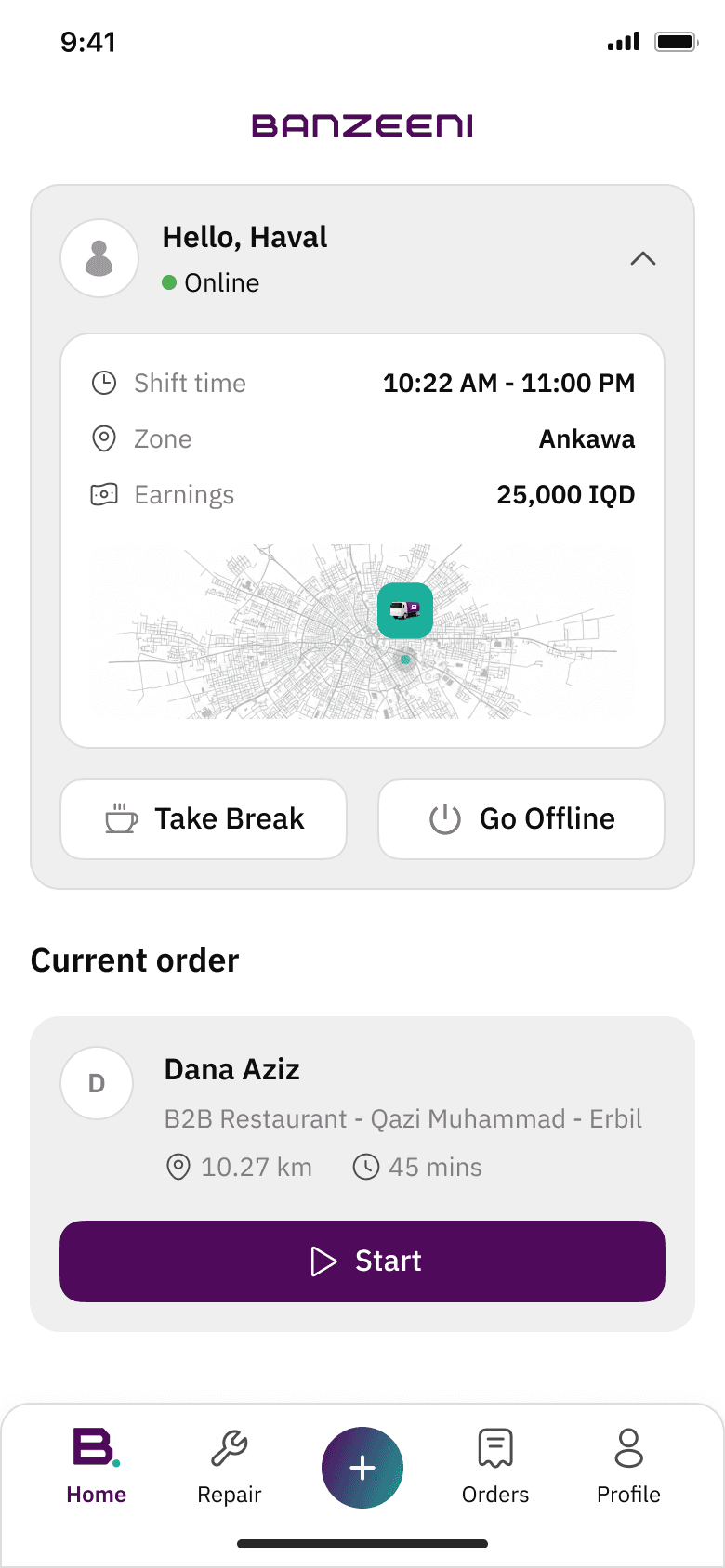
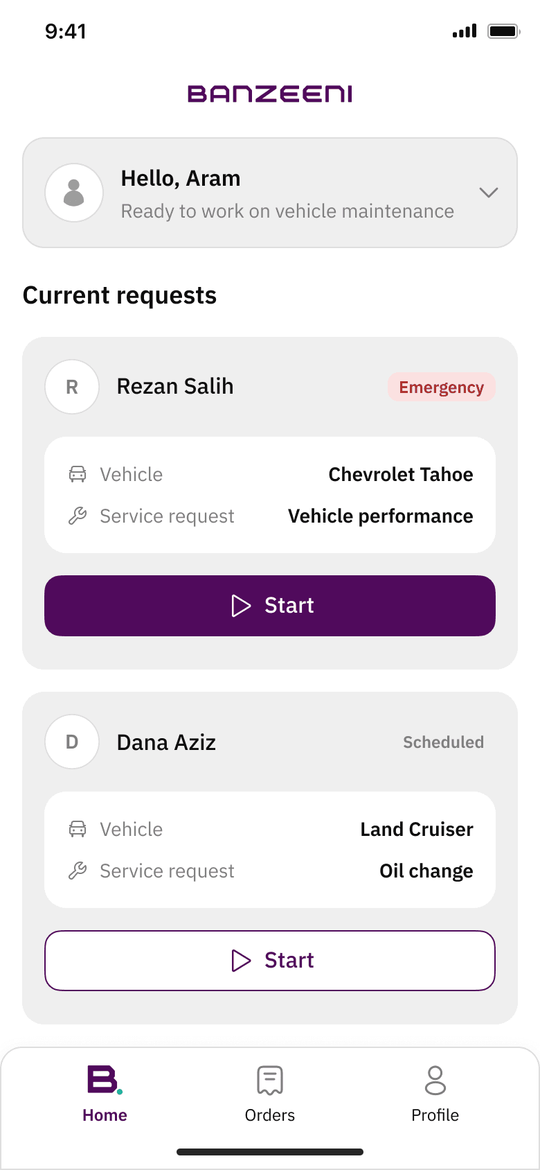
Every customer order lands with someone. The driver app serves three roles from one shell, and each screen shows one primary action at a time.
Three roles, one shell
Same nav bar, same card structure, same single primary button — only the job changes.
Pilot
Delivers fuel and services. Sees the next job, navigates, confirms delivery.
Stationary
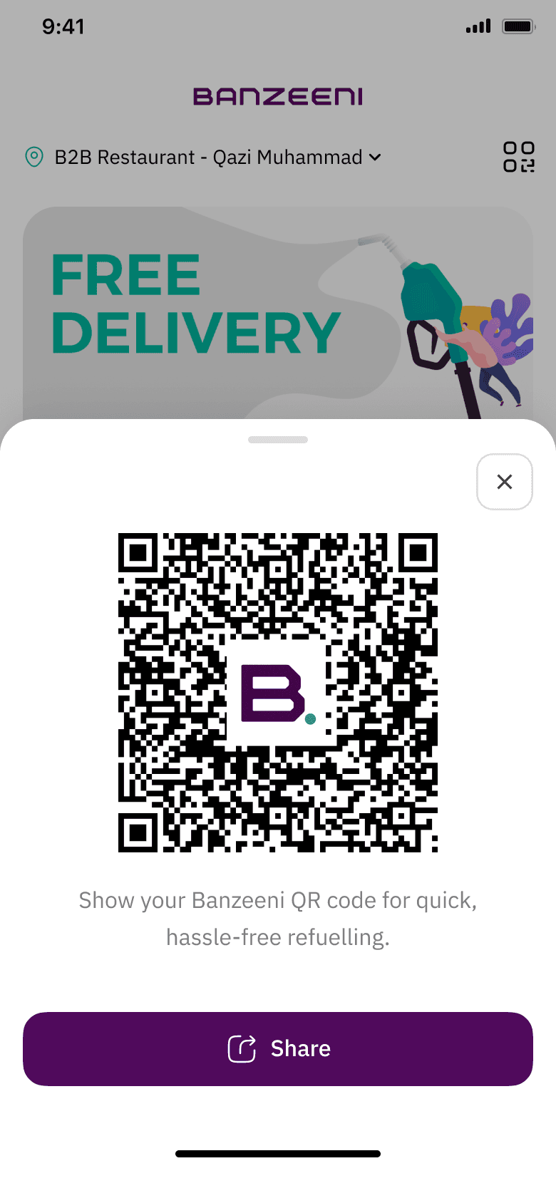
Works at a fuel station. Creates an order for a customer via QR or phone number.
Mechanic
Handles internal repair requests raised by pilots on their own vehicles.
Before the first job
Fuel is hazardous cargo, so a vehicle and equipment checklist gates the first job of every shift. It can't be skipped, and it's built as big tappable rows for gloved hands and bright light.
How the service works
The screens are the front stage. Behind them, a service blueprint maps what the customer sees against what has to happen in the operation for a delivery to arrive.
Four bands: what the customer does, what they touch, what the app shows, and what the system does behind it.
What the blueprint settled
Nearest certified pilot
Orders dispatch to the closest pilot cleared for fuel handling.
Zone-based fee
The fee is set by delivery zone and shown before the customer confirms.
One shared order status
The same status moves the customer's tracking screen and the pilot's job screen.
What testing changed
Usability sessions with 10 customers and 5 pilots across fuel delivery, ride-hailing and the wallet. Most of the flow held. What broke was never the structure — it was the defaults and the feedback.
What worked
- Reorder in one tap from the last order.
- Live pilot tracking felt reassuring.
- Safety steps read as professional and built trust.
Found → changed
Fuel delivery
- First-time users were unsure about fuel volume — litres vs full tank.
- Full tank became the default option, with litres as the alternative.
- The safety checklist felt like it slowed delivery.
- Checklist moved to once per shift instead of once per order.
- Confirmation page had an unclear price breakdown.
- Fuel price and delivery fee split into separate lines above the total.
Ride-hailing
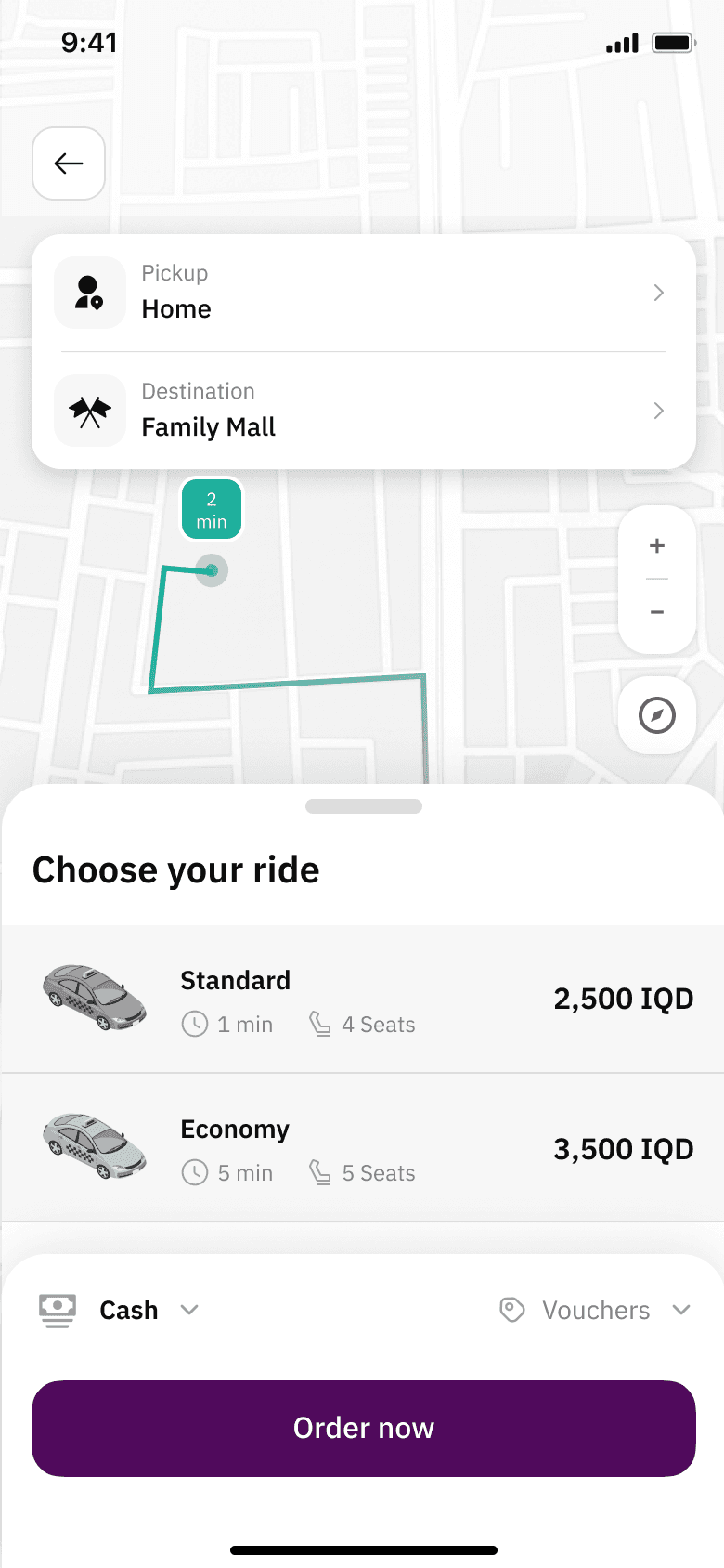
- Switching vehicle categories wasn't clear — icons too subtle.
- Category selector rebuilt as labelled cards with the price on each.
- No clear feedback when a promo code applied.
- Inline success state with the new total, plus a toast.
- Cancellation reasons weren't visible after a cancel.
- Reason shown on the order card and in the order history.
Wallet and loyalty
- Unclear whether cash payments earn points.
- “Earns points” label shown on every payment method, including cash.
Foundations
There was no design system when I joined. I built one from scratch for mobile and web: type scale, colour tokens, icon set, components, and rules for three languages and two modes.

Three languages, two modes
English, Arabic and Kurdish, LTR and RTL, light and dark — one screen, four ways. Every component was built to mirror, and the type scale was tuned so Arabic and Kurdish sit at the same visual weight as English.
English
Arabic · RTL
Kurdish
Dark mode
The website
The same system on the web: the seven services, the same type scale and tokens, and one entry point for downloading either app.
Two apps, a website and a design system, handed off in nine months. The rule held: one decision per screen, seven services, three languages, two modes.
The Outcome
Both apps and the website were redesigned end to end on one design system and one flow pattern, then handed off for build. The rebuilt app went live on Google Play and the App Store in July 2026.
- customers
- 100K+
- services delivered
- 200K+
Google Play · 27 Jul 2026
A fresh start: new design, new features — we've rebuilt our app from the ground up.
From the store listing
One rule, seven services, two apps. The system was the deliverable — the screens were just where it showed.